Stepan Vedunov

ZVV ticket machine

In a university module we redesigned the interface of Zurich's ZVV ticket machines. Over several design sprints we simplified complex flows, modernised the visual design, and added customisation and accessibility features.

Team
Jeanne Antonin, Ege Seçgin, Elia Salerno, Stepan Vedunov
Date
2023, university module
Role
UX Research, UI Design, ZHdK
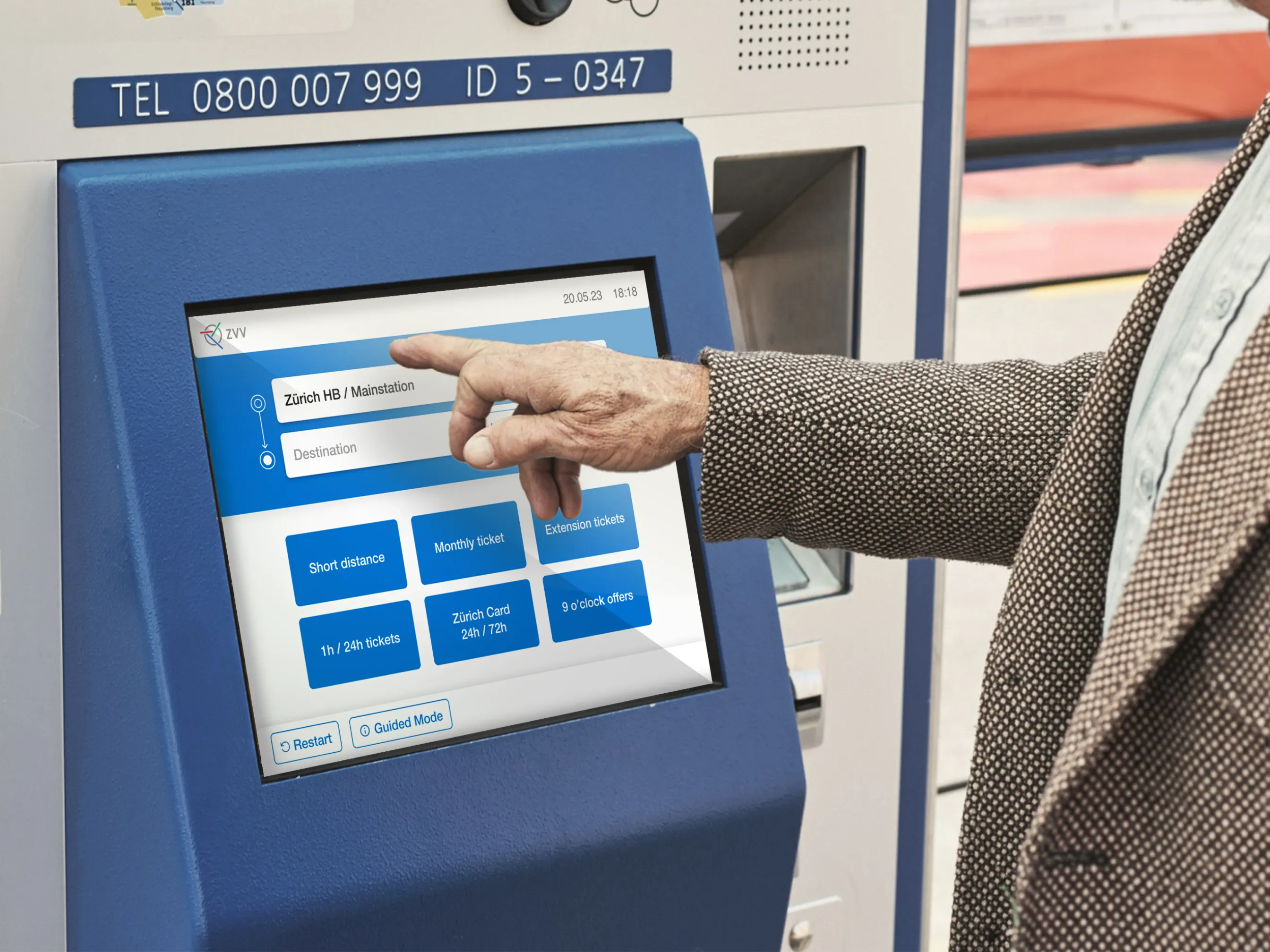
Redesigned ZVV ticket machine screen

My role

  • Heuristic evaluation, and a competitor analysis of ticket machines in several countries.
  • Led observations of people using the old machines in real situations.
  • Redesigned the full ticket-buying flow, with better accessibility.
  • Ran iterative user tests, ending with street tests of the final prototype.

Research
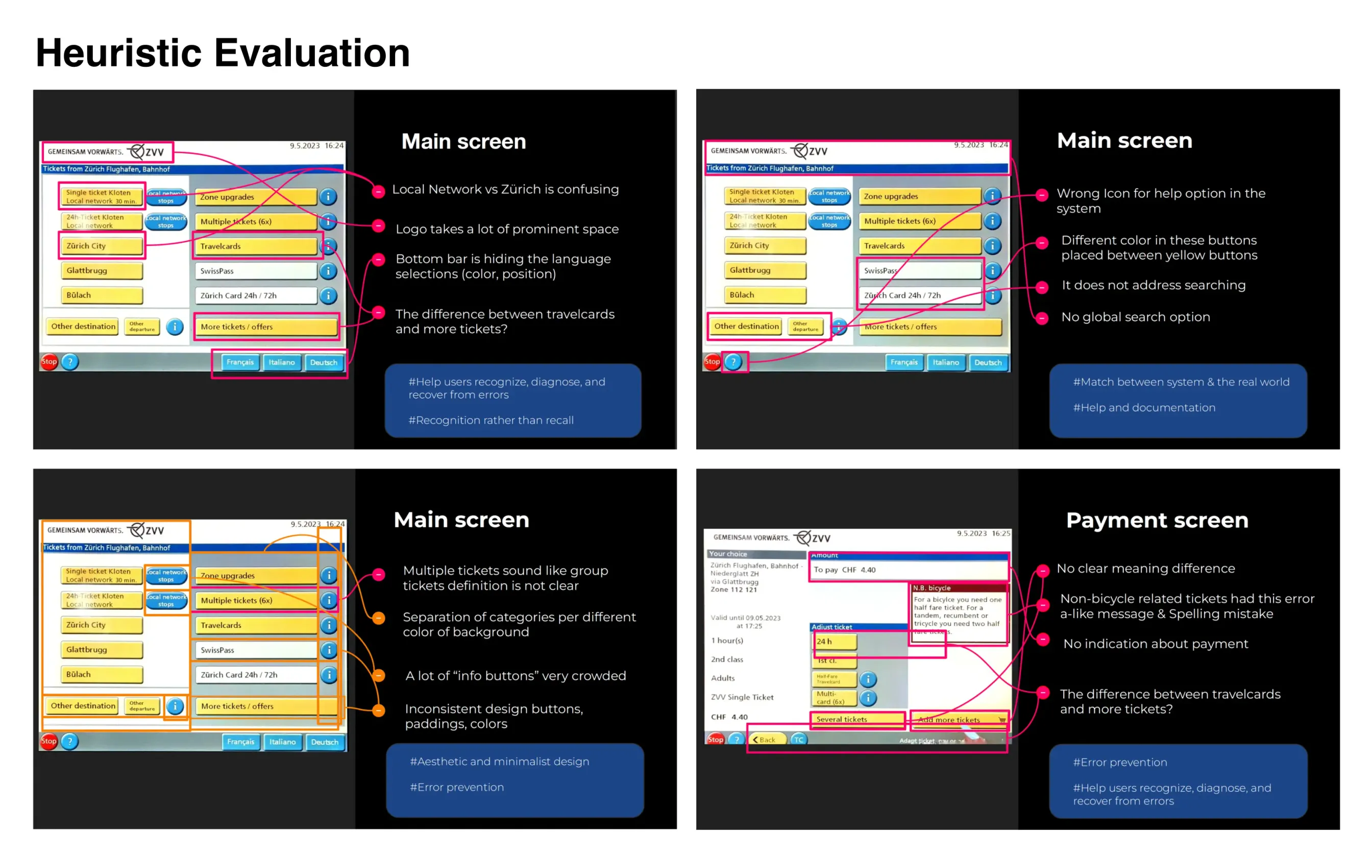
Heuristic evaluation of the current machines
Heuristic evaluation of the current machines.
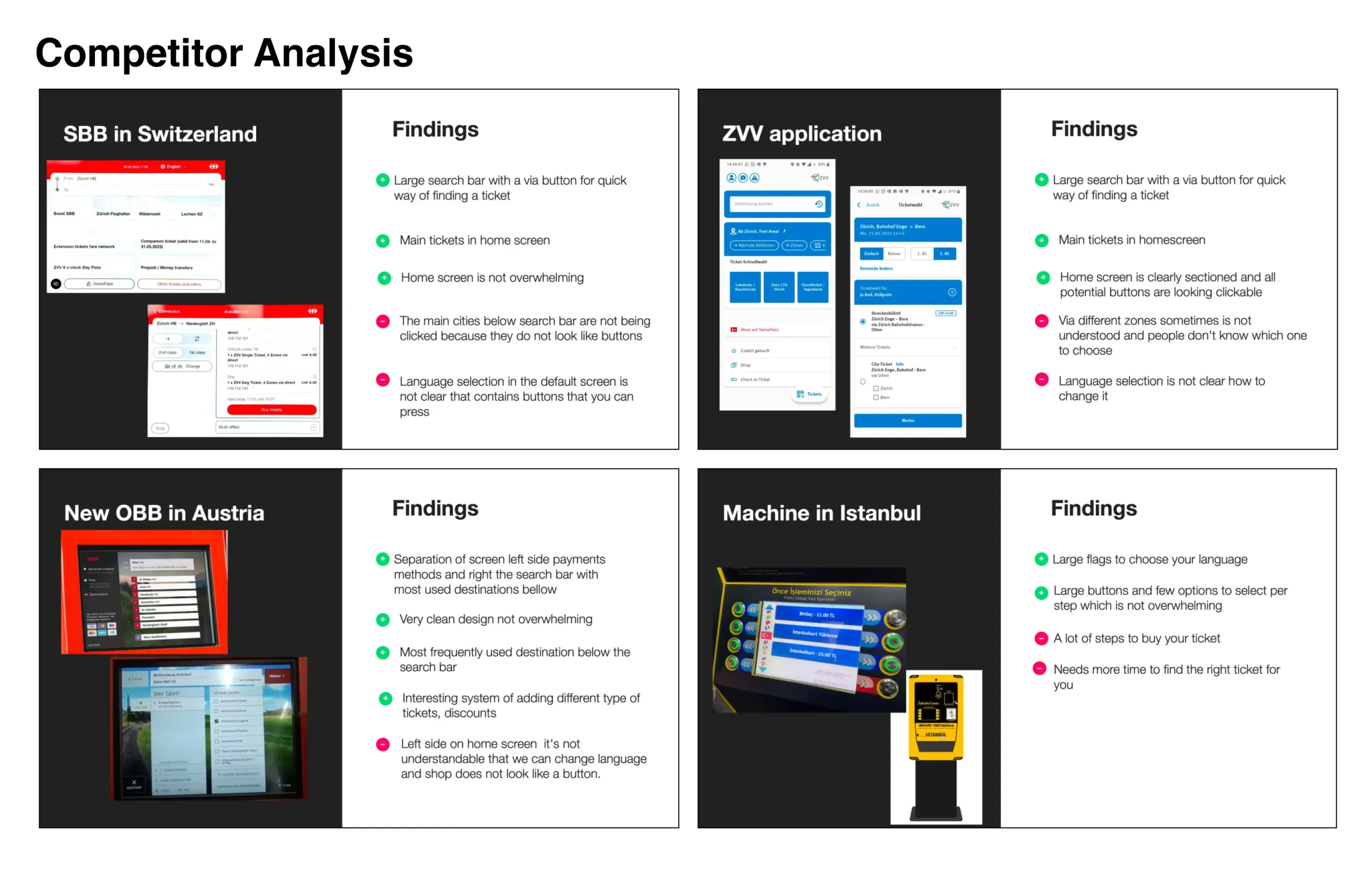
Analysis of ticket machines in different countries
Ticket machines in other countries.
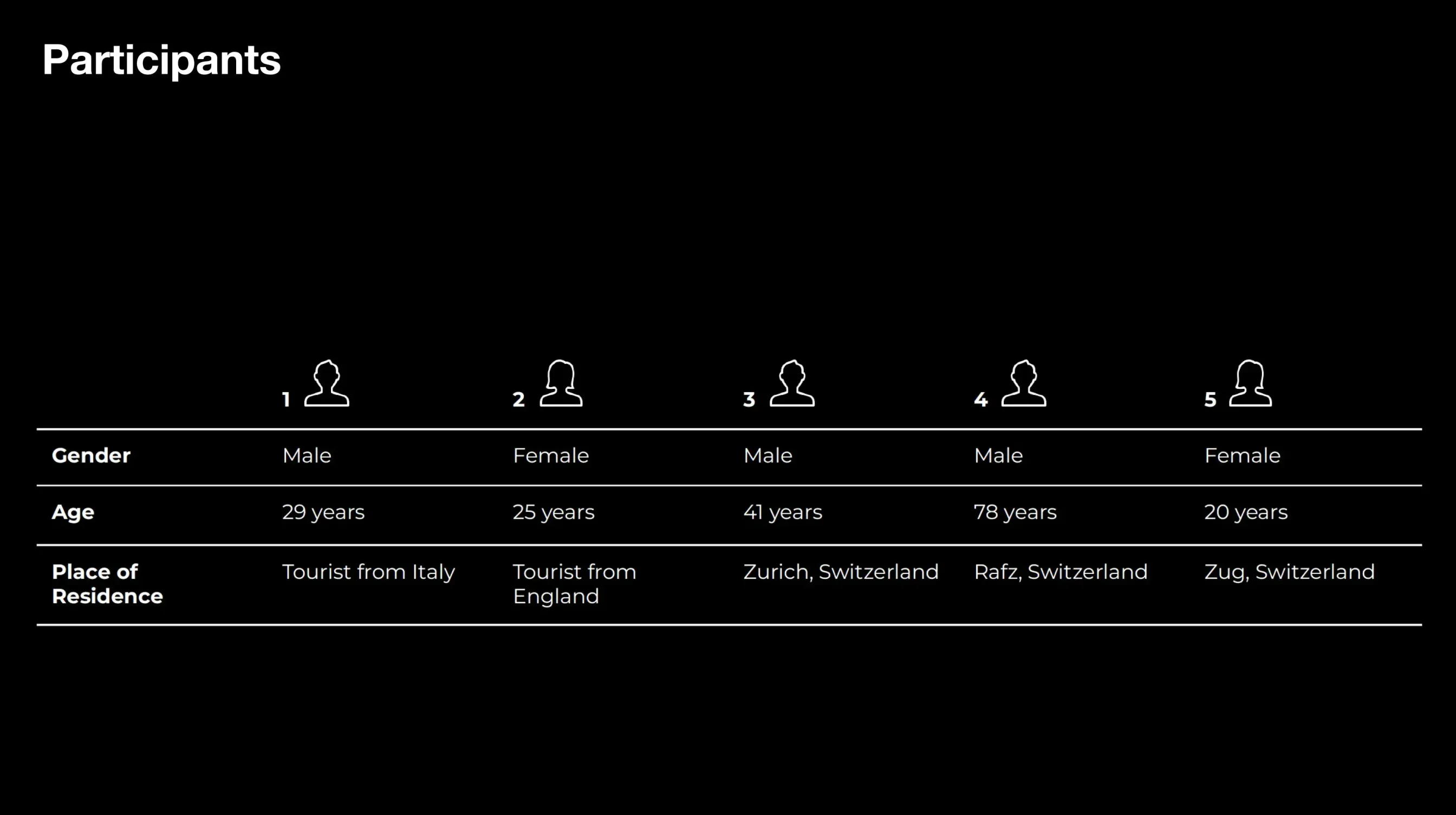
The five observation participants
Five participants using the old software in their everyday setting.
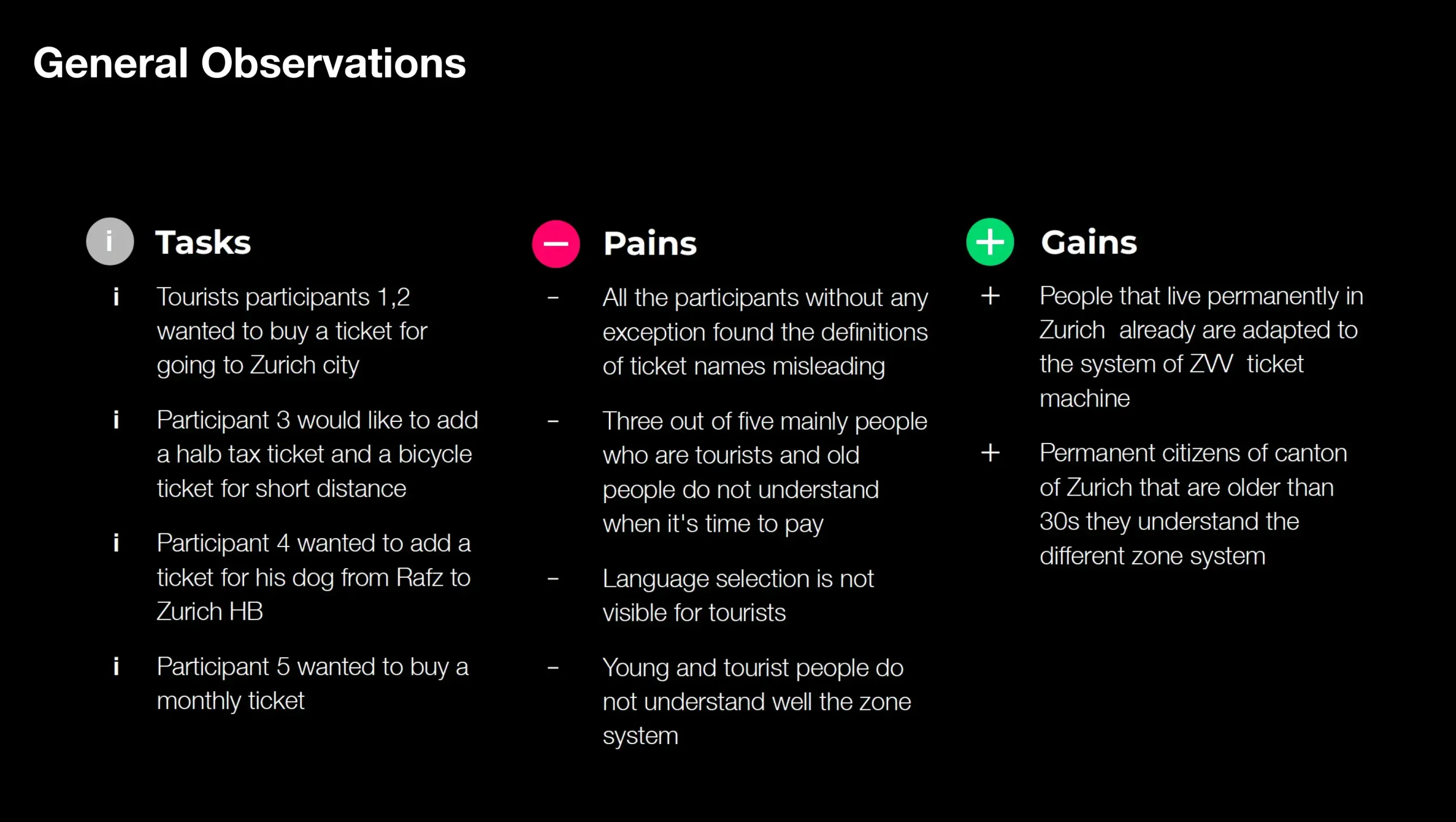
Summary of observation results
What the observations showed.
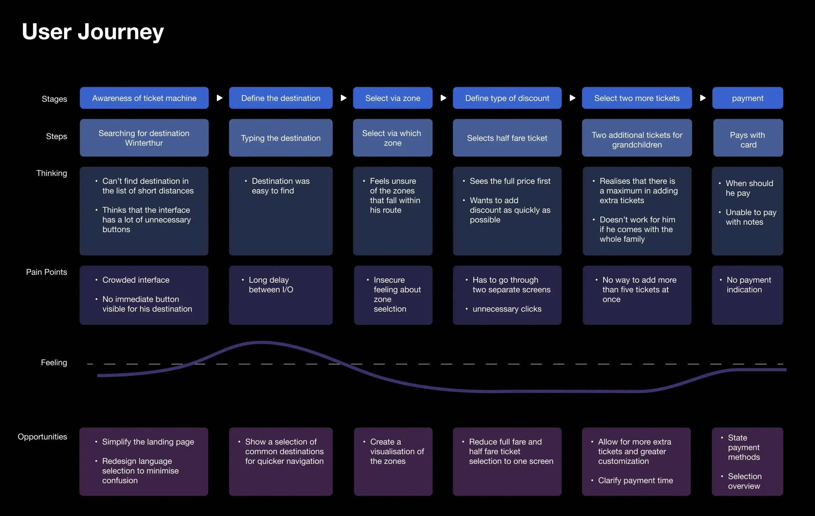
User journey with the current ZVV ticket machines
The journey with today's machines.

Iterations

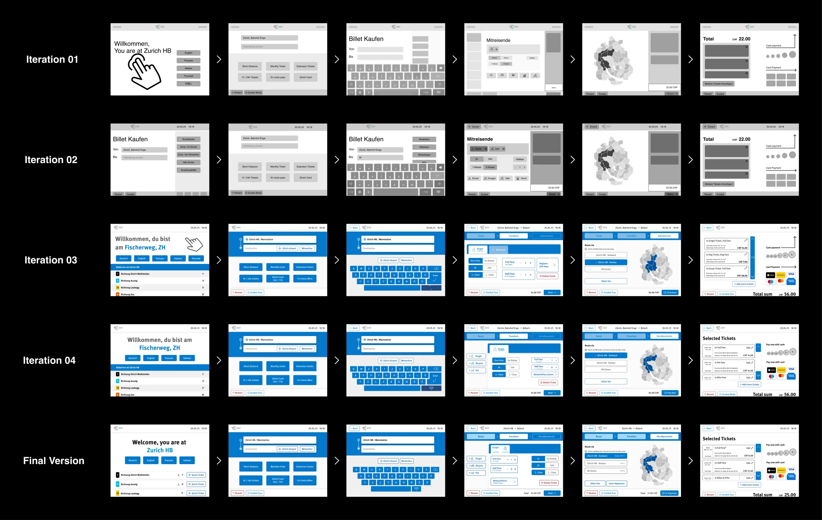
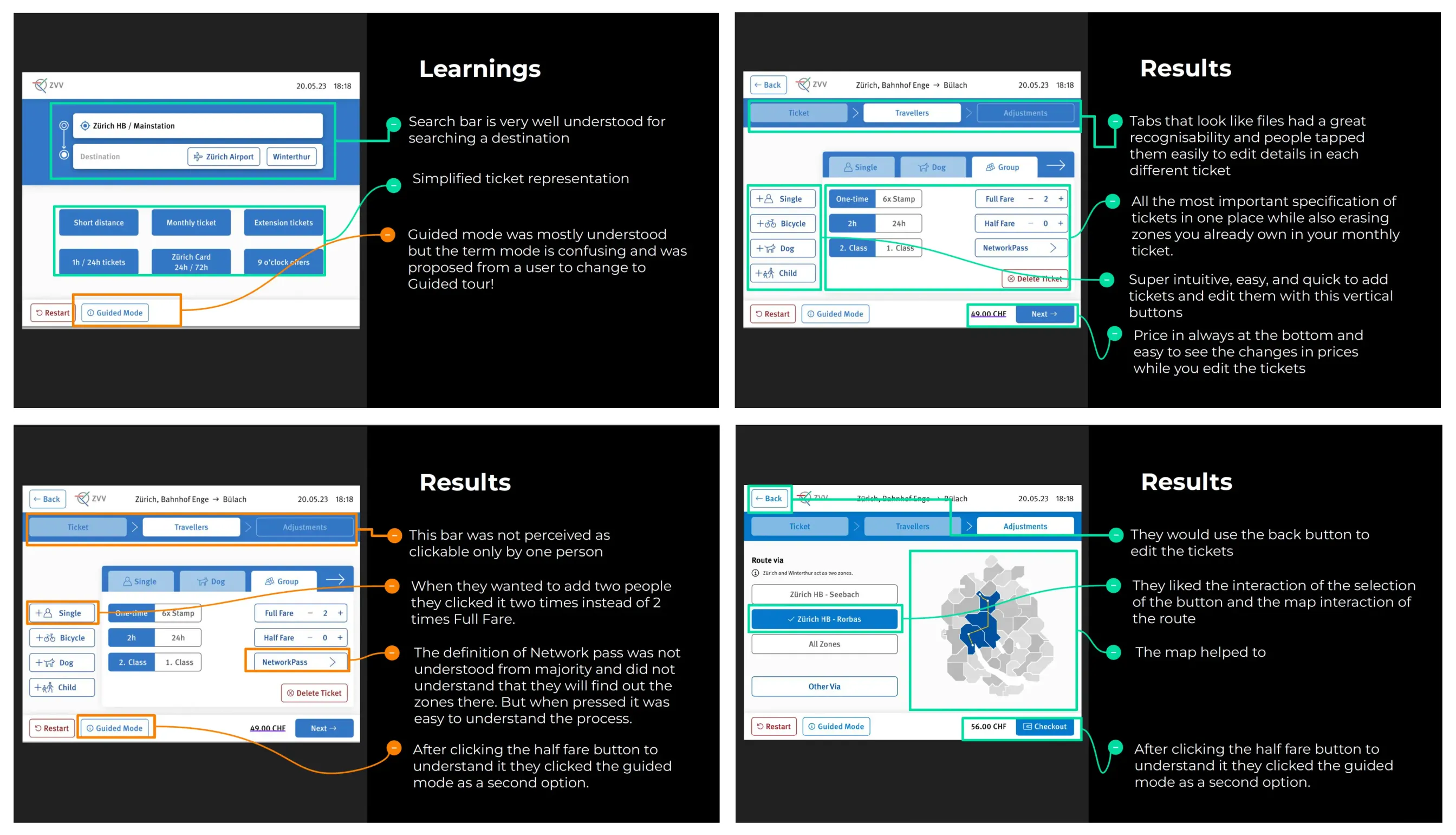
Overview of prototype iterations
Every iteration was tested with real users.

Result

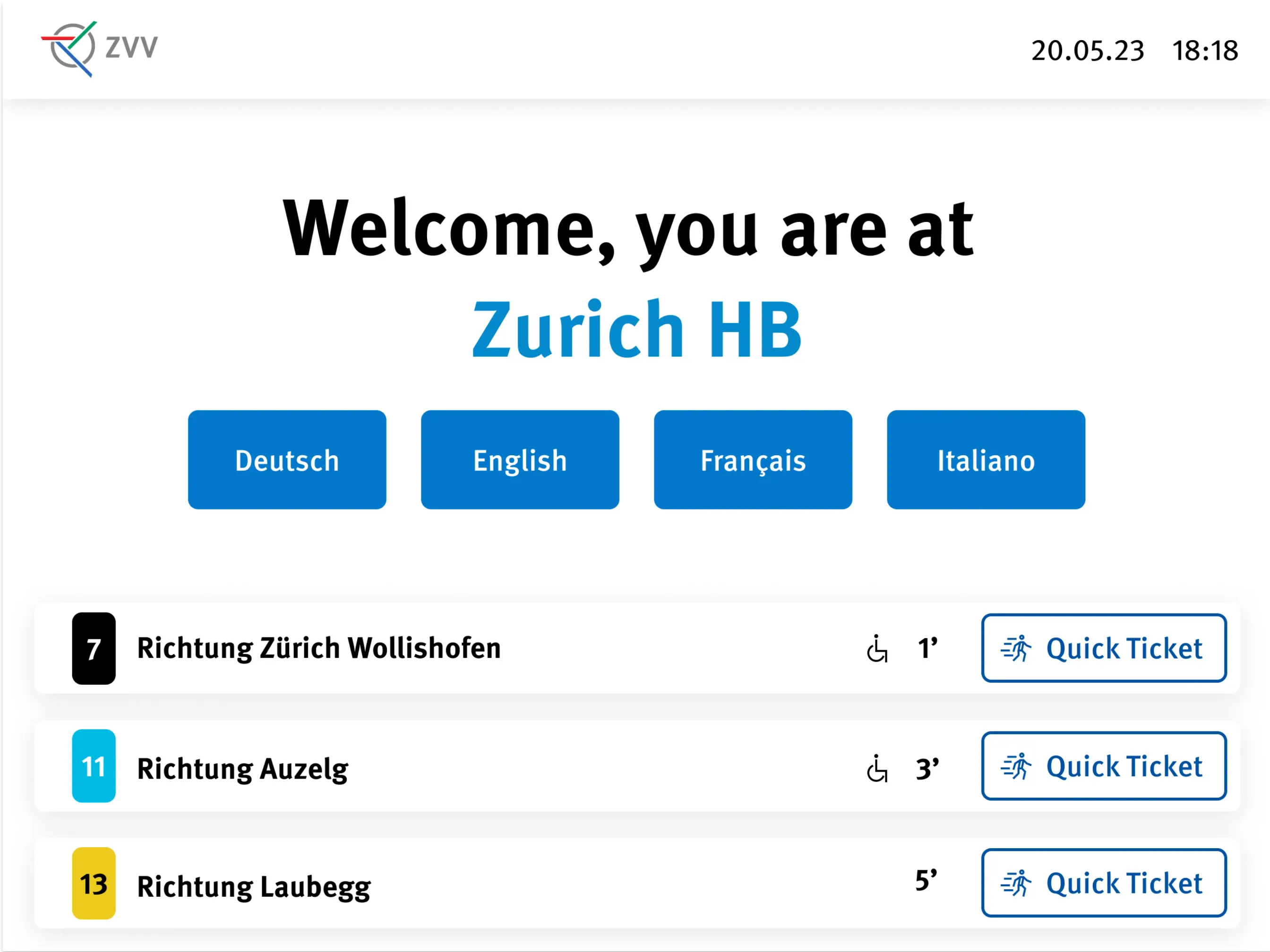
Redesigned home screen with quick actions
Home screen with quick actions.
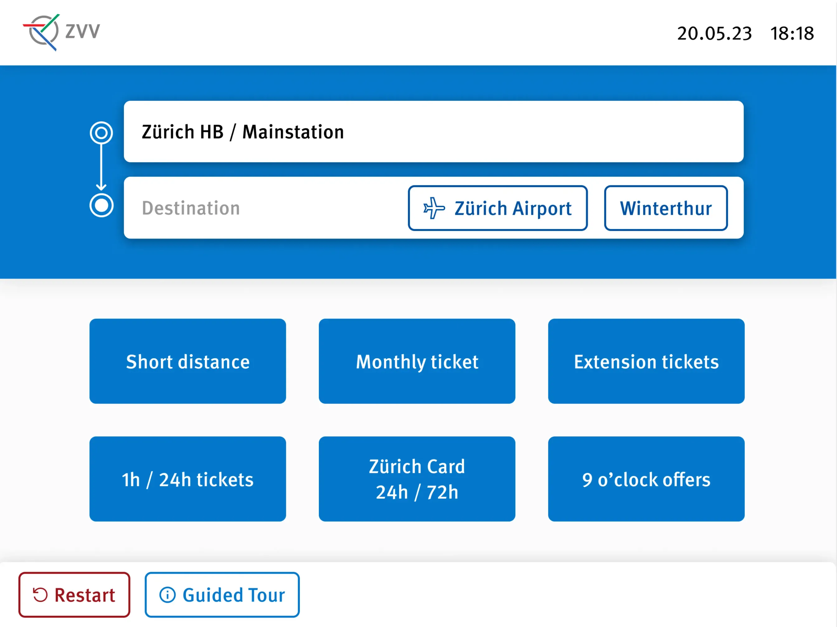
Ticket selection with clear separation between options
Clear separation between tickets.
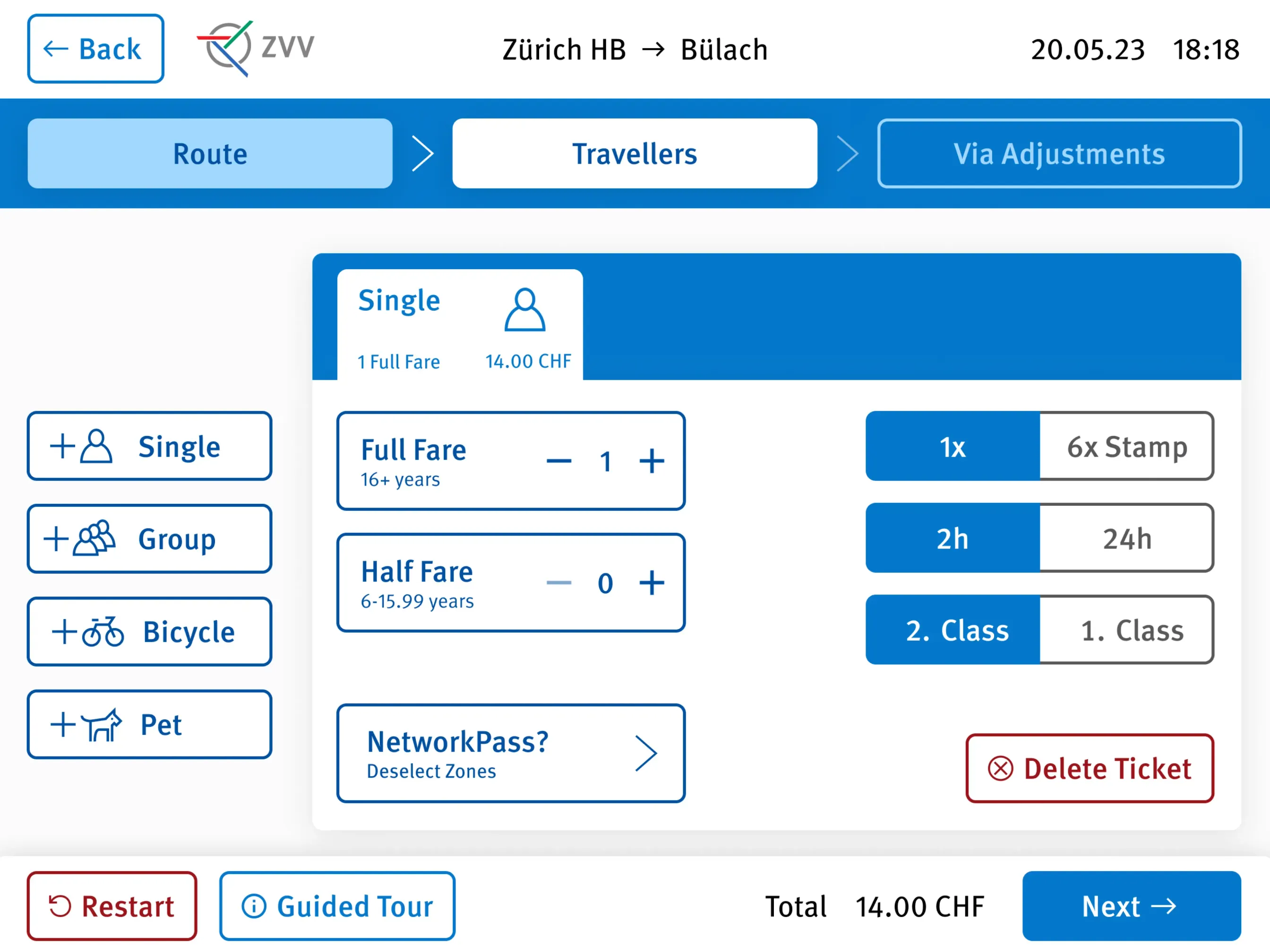
Customising a ticket for a specific route
Customising a ticket for a route.
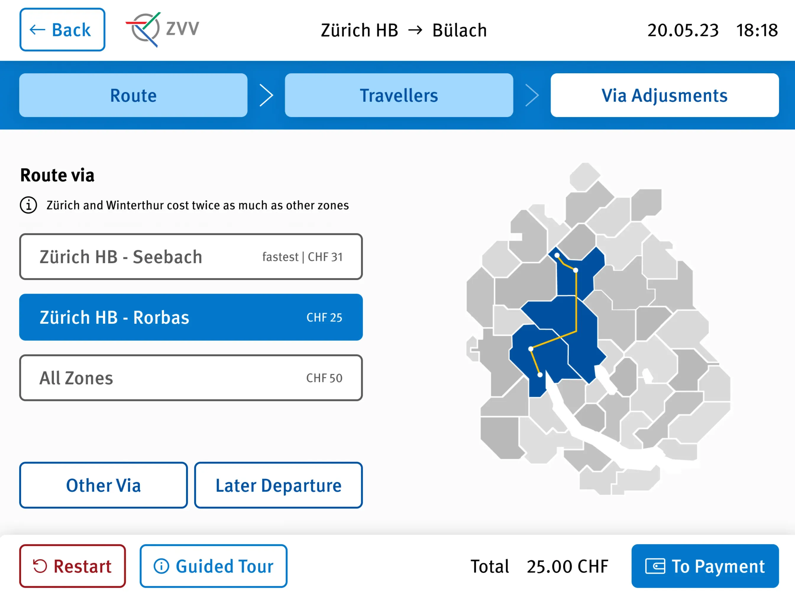
Optional zone adjustment step
Optional zone adjustments.
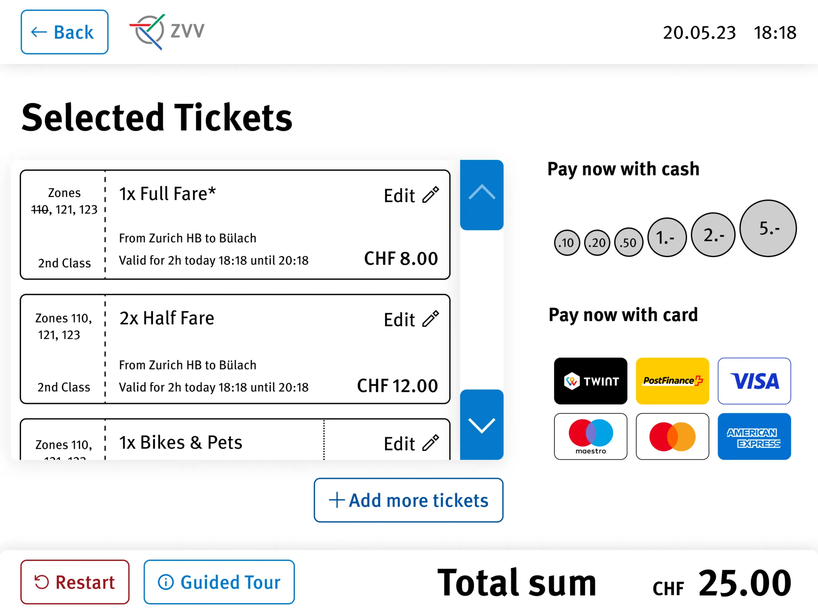
Checkout with selected tickets and payment options
Checkout.
Testing the final prototype with people in the city
Street tests of the final prototype.

Outcome

In street tests, the final prototype did significantly better than the current machines across all user groups. People found it more accessible and easier to use.

vedunov.com setup utility

System
Nuxt 4, Vue 3 and Nuxt Content. Static pages on Netlify, no server, no tracking.
Languages
English and Swiss High German. Same pages, two content folders, /de in front of every address.
Tokens
Primitives → semantic tokens → components, compiled and contrast-checked on every build. The same pipeline I use at work.
Type
Inter and Geist Mono, self-hosted, swap. Titles are Inter set tighter, instead of a third font.
Signal
#E8540C on the side-project tiles and focus rings. The read-mode switch gets its own red-orange keycap, #E2421B.
Motion
Pages blur in and out, sections sharpen as you scroll, and neighbours step back when you hover. All of it stops with reduced motion.
Accessibility
WCAG 2.2 AA. axe: 0 issues on every page.
Performance
Lighthouse mobile, 24 pages: performance 94, accessibility 100, best practices 100, SEO 100 (lowest of each).
Keys
Delete opens this screen. Esc closes it.
last check 2026-11-09