Stepan Vedunov

Alpha Factory®

Alpha Factory is OWT's framework for lasting AI adoption in large businesses. It offers a structured way to assess, design, deploy and maintain AI, and turns one-off projects into lasting strengths. It needed its own identity, recognisably part of OWT but clearly its own thing.

Team
Astrid LeQuéré, Stepan Vedunov
Services
brand identityguidelinesweb
Date
2026
Role
UX/UI Designer
Quick readFull story

TL;DR

Problem
OWT's AI offering needed its own identity, part of OWT but clearly distinguishable.
My role
Co-created the branding and the sub-sites.
What I did
The UX/UI of the sub-site, the Alpha Factory® logo and the one-line illustrations, and co-created the brand guidelines.
Outcome
The brand and the sub-site are live on owt.swiss.
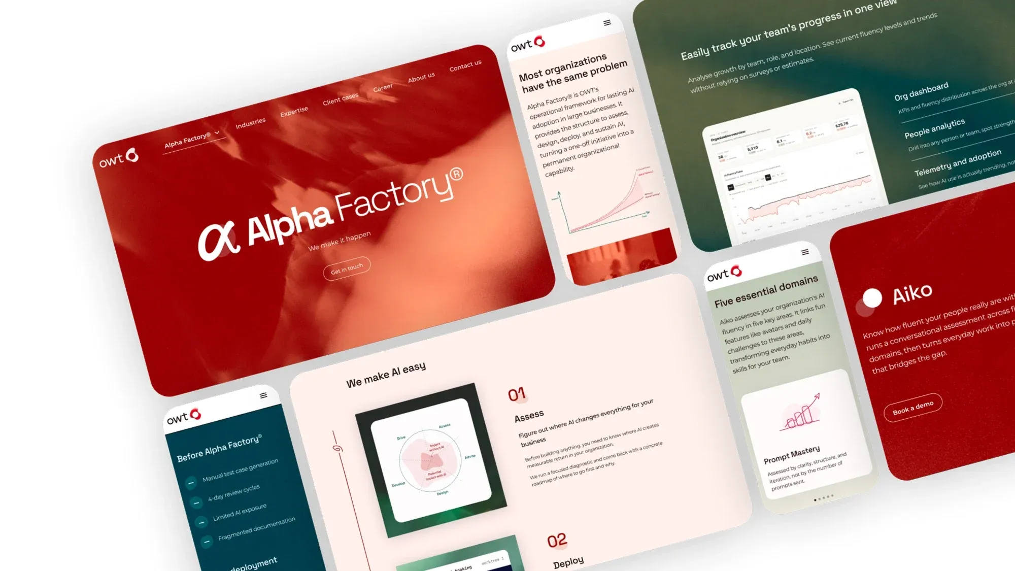
Pages of the Alpha Factory sub-site laid out at an angle, in deep red, blush and teal.
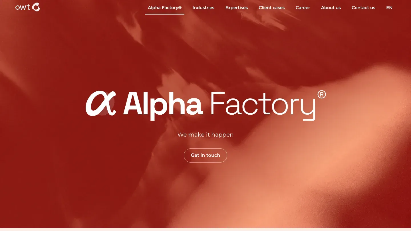
The Alpha Factory landing page. The alpha glyph and the wordmark on a blurred red background, with the line "We make it happen".
The landing page of the sub-site.
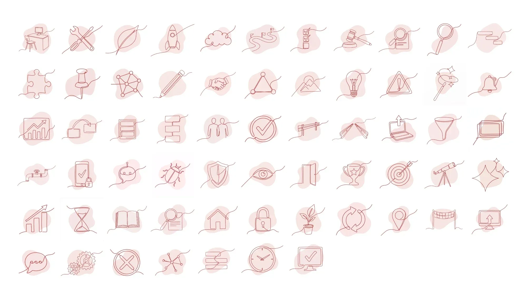
A grid of one-line illustrations in red, each drawn as a single continuous stroke over a soft blush shape.
One-line illustrations bring the human hand into an AI brand.
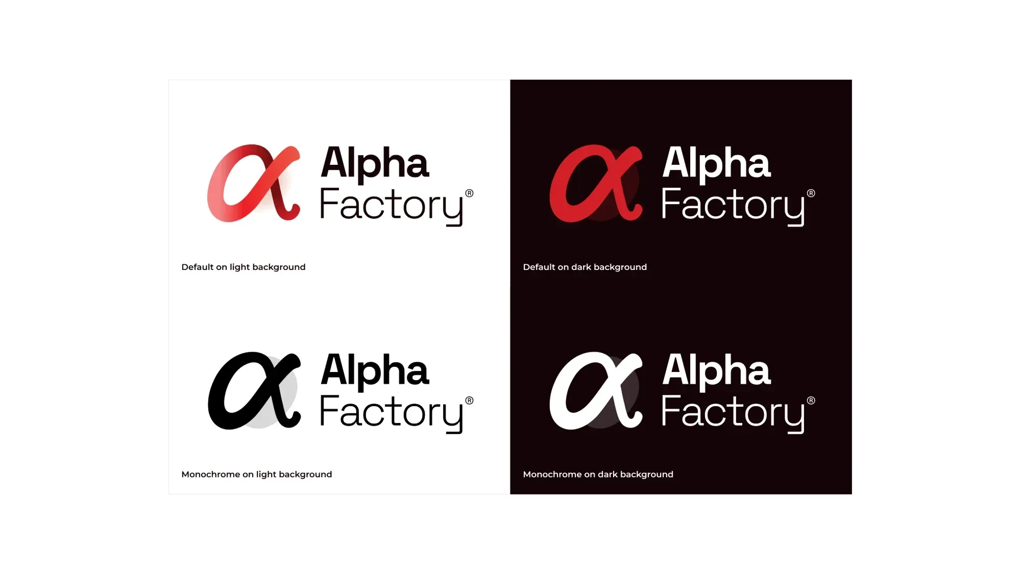
Four versions of the Alpha Factory logo, in colour and monochrome, on light and dark backgrounds.
Logo in multiple variants.

Context

The goal was an AI brand that still feels human. The strongest AI brands each bring the human hand back in their own way: Claude with its illustrations, Microsoft with its squiggly lines. For Alpha Factory that became one-line illustrations that look drawn by hand. We combined that with an earthy colour palette taken from nature and imagery that has an abstract yet organic feel to it.

My role

  • Co-created the Alpha Factory® brand, including the logo, the brand guidelines and the sub-site at owt.swiss/en/alpha-factory.

A human brand for AI

AI brands easily end up cold: dark screens, neon gradients, glowing networks. Alpha Factory is about people adopting AI in their everyday work, so the brand had to feel like it was made by hand. Every element does a bit of that, from the illustrations to the colours to the photos.

The voice is three words. Impactful: a balance between innovation and pragmatism that turns ideas into lasting results. Sophisticated: a trusted partner with high-quality, tailored, Swiss-made work. Lively: energetic, and ready to make it happen.
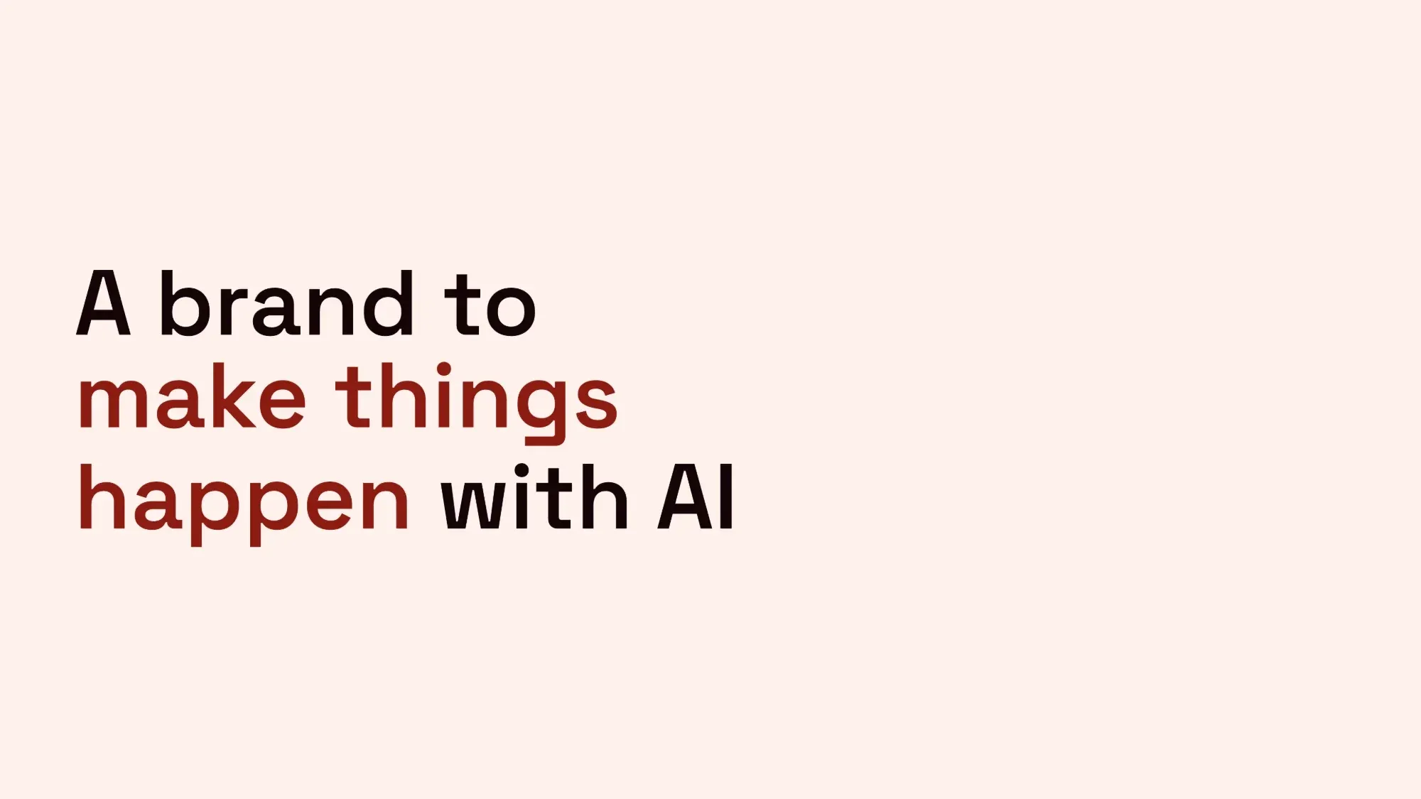
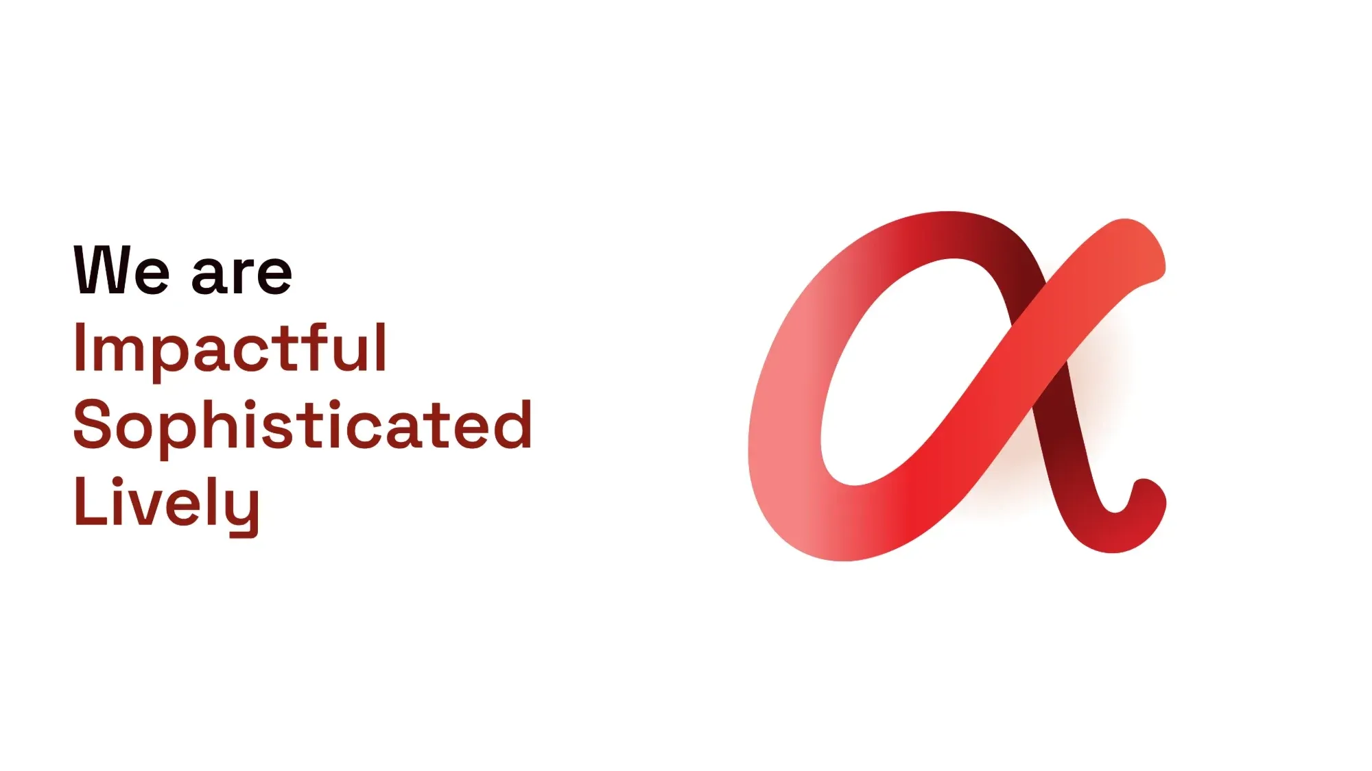
Brand-book page: A brand to make things happen with AI.
The idea in one line.
Brand-book page: We are impactful, sophisticated, lively, next to the red alpha glyph.
Alpha Factory's three keywords.

Logo

The logo is an alpha glyph next to the wordmark, drawn as a single ribbon with a gradient. Flat and monochrome versions cover print and places where the gradient can't work.

Four versions of the Alpha Factory logo, in colour and monochrome, on light and dark backgrounds.
Logo in multiple variants.

Colours from nature

A deep red (Deep AF) leads. Around it sit petal, blush, sage, forest and teal: soft, earthy colours that you'd find outside rather than on a screen. Black, grey and white complement the palette.
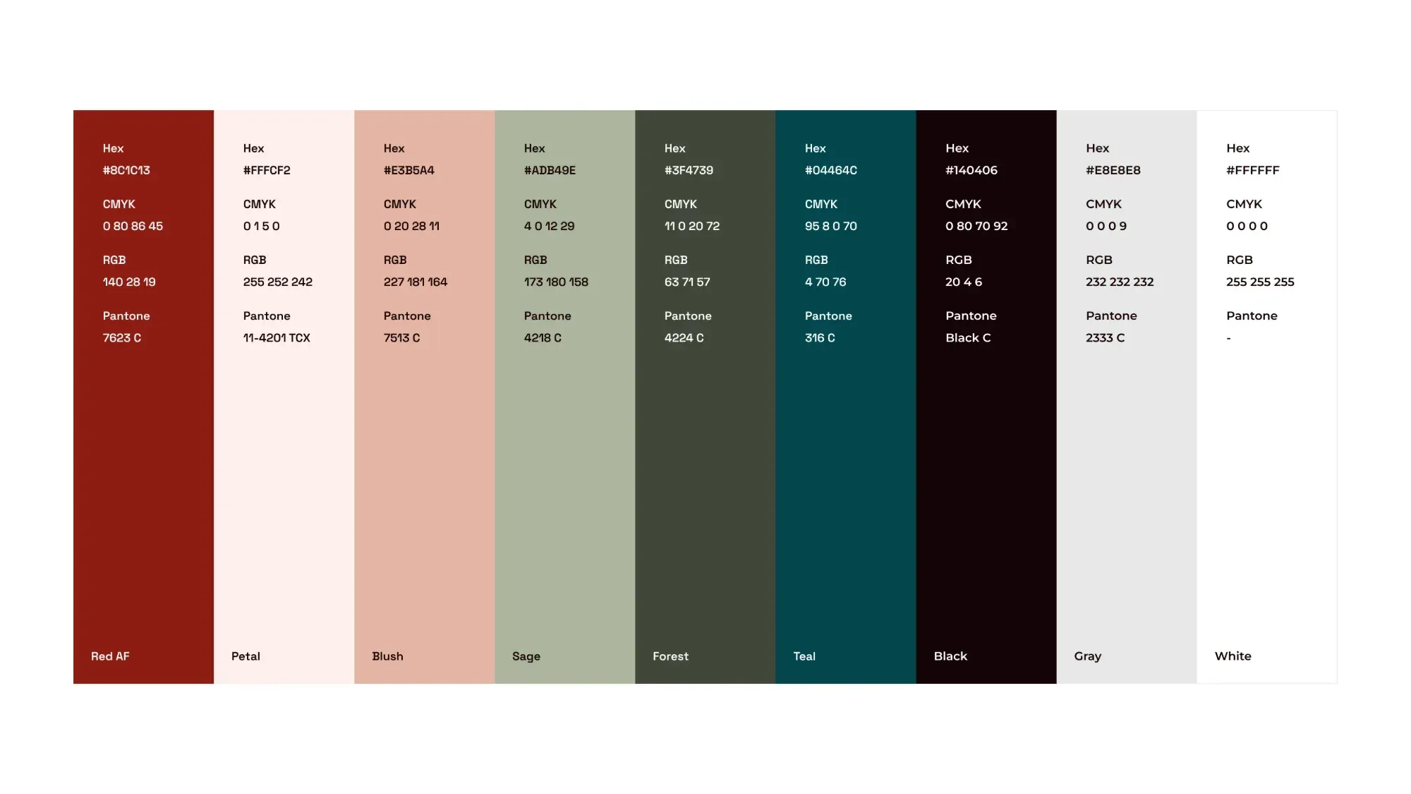
The full palette: red, petal, blush, sage, forest, teal, black, grey and white, with hex, CMYK, RGB and Pantone values.
The full colour palette.

One-line illustrations

For the new Alpha Factory® brand we created a library of continuous monoline illustrations. They support or simplify a key message where a photo or a detailed visual would be too much.

A grid of one-line illustrations in red, each drawn as a single continuous stroke over a soft blush shape.
Part of the illustration library.

Imagery

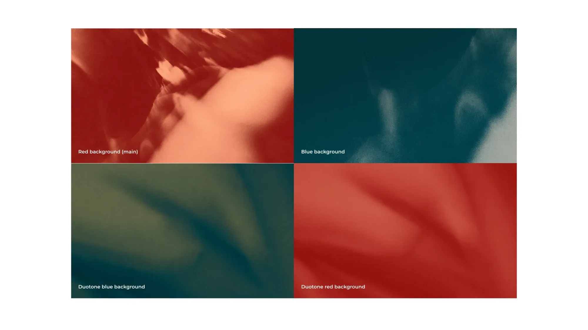
Four blurred, grainy motion images: red, teal, a teal-green duotone and a red duotone.
Red, teal and two duotones, used behind headlines.

Type

Space Grotesk sets the titles, while Montserrat is used for paragraph text, for better readability.
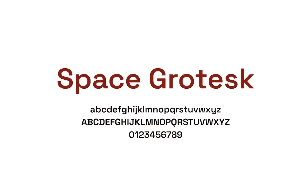
Space Grotesk in red, with the alphabet and numbers below.
Space Grotesk for titles.

The sub-site

The Alpha Factory landing page. The alpha glyph and the wordmark on a blurred red background, with the line “We make it happen”.
The landing page of the sub-site.
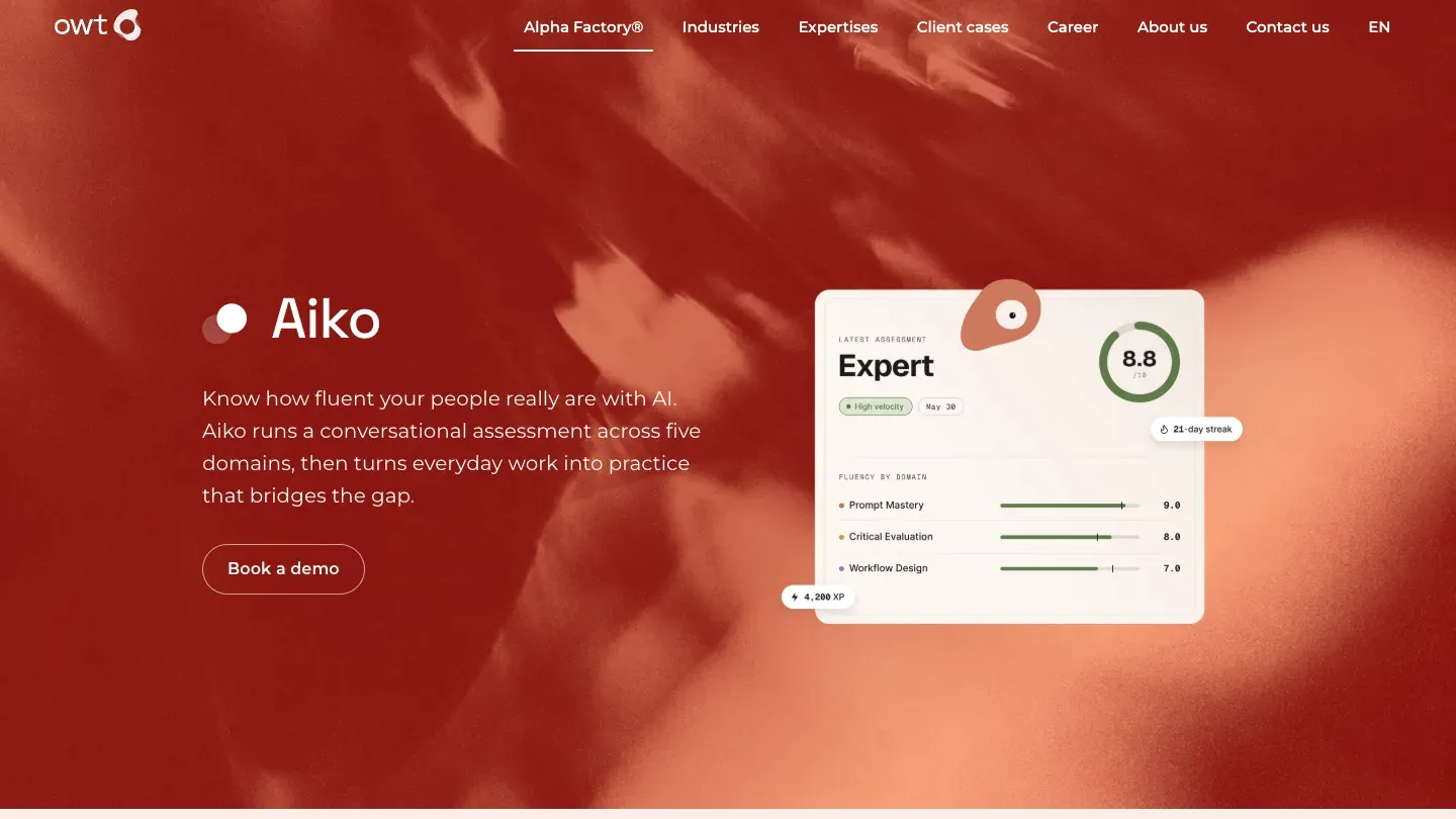
The Aiko product page: a red hero with a sample assessment card showing an expert score of 8.8.
The page for Aiko, an AI-fluency product.
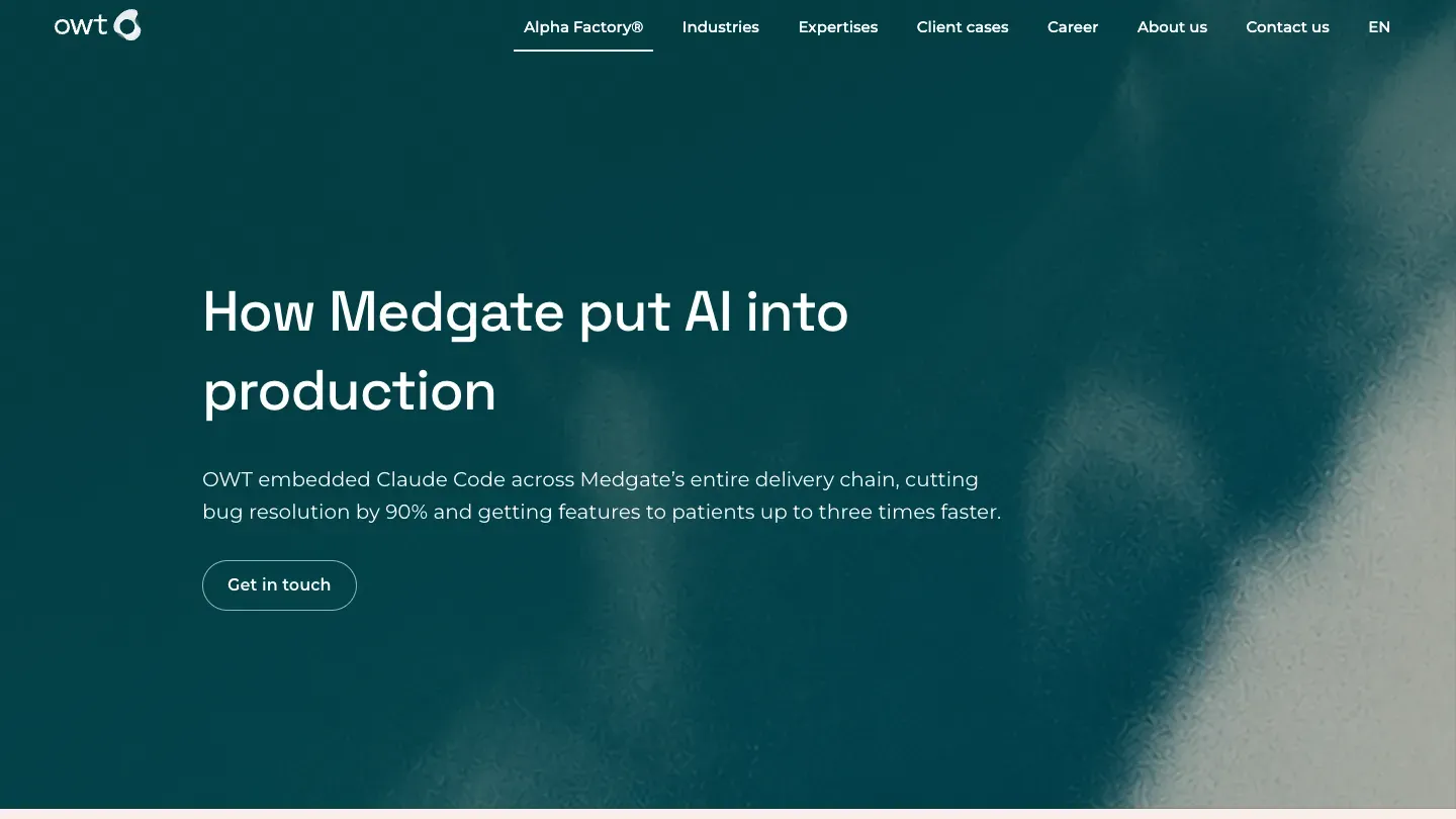
A client case page with a teal hero: How Medgate put AI into production.
The Medgate case page, in the teal variant.

vedunov.com setup utility

System
Nuxt 4, Vue 3 and Nuxt Content. Static pages on Netlify, no server, no tracking.
Languages
English and Swiss High German. Same pages, two content folders, /de in front of every address.
Tokens
Primitives → semantic tokens → components, compiled and contrast-checked on every build. The same pipeline I use at work.
Type
Inter and Geist Mono, self-hosted, swap. Titles are Inter set tighter, instead of a third font.
Signal
#E8540C on the side-project tiles and focus rings. The read-mode switch gets its own red-orange keycap, #E2421B.
Motion
Pages blur in and out, sections sharpen as you scroll, and neighbours step back when you hover. All of it stops with reduced motion.
Accessibility
WCAG 2.2 AA. axe: 0 issues on every page.
Performance
Lighthouse mobile, 24 pages: performance 94, accessibility 100, best practices 100, SEO 100 (lowest of each).
Keys
Delete opens this screen. Esc closes it.
last check 2026-11-09